Collage of nine data visualization charts, including bar graphs, line graphs, radar charts, and pie charts, in shades of orange, green, and brown.

Assessment Chart Types

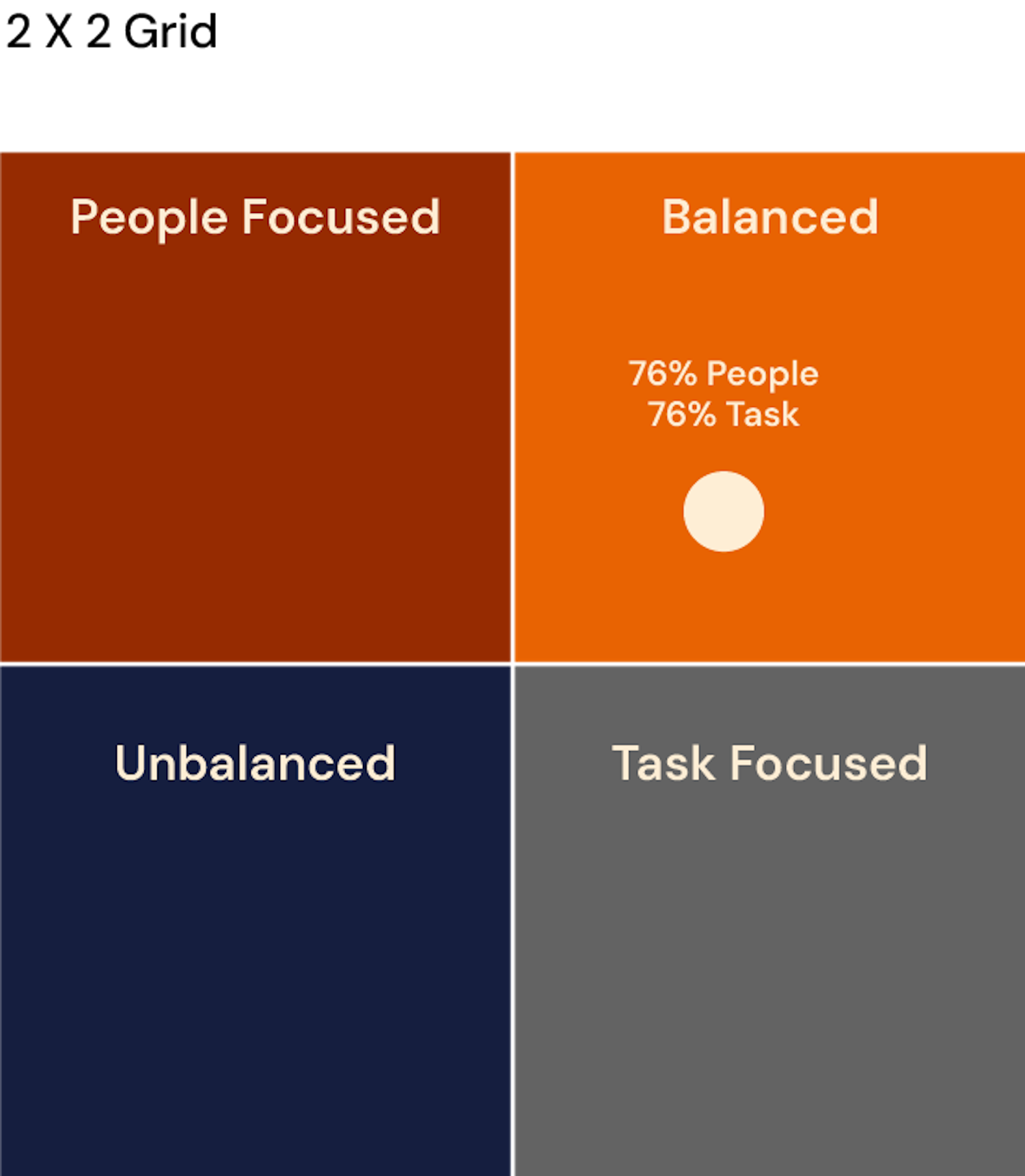
Bring your data to life with brilliant chart types

Brilliant Assessments offers a range of chart types to help visualize assessment results clearly. From bar and line charts to spider and polar charts, these tools make it easy to present data in a way that’s easy to understand and analyze.

Use built-in charts to compare performance, track trends over time, and highlight key insights in reports and dashboards.

See all our chart types in the sections below, or to find out more about how charts are generated, find out more about the results wizard here.

Horizontal bar charts

While functionally similar to Vertical Bar Charts, Horizontal Bar Charts offer the added benefit of not being limited by page width. This layout also affords extra room for text descriptions, making the data more accessible.

Bar chart comparing feelings about insects between women and men. Women are more likely to dislike insects, while men are more likely to like them. The chart categories include dislike, neither like nor dislike, and like.
Bar chart comparing the number of hours worked by men and women in different countries, with the United States showing men working more hours than women.
A horizontal bar chart with five colored segments representing survey results about online shopping, displaying percentages in each segment. The segments are red, orange, green, and blue, indicating different responses.
Bar chart showing annual net migration for five countries from 2012 to 2015, with green bars for 2015 and white for 2012, indicating positive or negative migration trends.
Bar chart comparing the types of movies favored by males and females, showing that males prefer action movies, females prefer romantic movies, and both genders enjoy comedy.
Horizontal bar chart showing data distribution with a blue segment labeled 87% and sections in red, orange, and green.

Multi horizontal bar charts

These charts mirror the functionality of Multi Vertical Bar Charts but come with the same advantages as Horizontal Bar Charts: no width limitations and ample space for text. It is ideal for detailed cohort reports that require extensive labels.

multi-horizontal-chat-using-percentages
multi-horizontal-bar-chart
multi-horizontal-background-shading-graph
ulti-horizontal-bar-chart-using-likert-scoring
multi-horizontal-bar-chart-using-rating-lines
multi horizontal bar chart

Vertical bar charts

This chart style illustrates the comparative performance across various sections, subsections, questions, or segmentations. Whether looking at multiple categories or just one, these charts can present data as either percentage scores or average actual scores, making them highly versatile.

Bar chart comparing installation times for software: Windows, Mac, Linux, iOS, and Android, with iOS having the longest installation time.
Bar graph displaying survey results of national pride levels among U.S. residents aged 18-29 from 2020 to 2023. The percentages increase from 64% in 2020 to 87% in 2023, with data points for the years 2020, 2021, 2022, and 2023.
Bar graph showing the percentage of people in different age groups who prefer online shopping, with the highest preference in the 25-34 age group.
Bar graph showing percentages for Leadership 64%, Innovation 57%, Strategic Focus 67%, Ability to Execute 93%, Customer Focus 87%.
Bar graph showing the percentage of employees satisfied with work-life balance, with satisfaction levels marked on the y-axis and different years on the x-axis. The satisfaction increased significantly in recent years.
Bar chart showing customer satisfaction ratings, with ratings from 1 to 5, where the majority of respondents rate their satisfaction as 4 or 5.

Multi vertical bar charts

Specifically designed for feedback and cohort reports, Multi Vertical Bar Charts offer an enhanced layer of analysis by showing benchmark results alongside individual or group responses. This feature provides a richer context for performance assessment.

Bar chart comparing alcohol consumption in 1980 and 2010 across different regions, with Europe having the highest consumption in 1980 and 2010, North America showing a slight decline, and other regions showing variations.
Bar graph comparing numerical data with three age groups, 15-24, 25-34, 35-44, across four categories labeled A, B, C, and D. The categories have different colored bars representing three groups: 2010 (white), 2018 (black), and 2019 (gray).
Bar chart showing varying values for categories X, Y, Z, and W with different scores for Group A and Group B.
Bar chart comparing $1,000 initial investments in S&P 500, small-cap stocks, and REITs over 5, 10, and 20 years, showing total values in USD.
Bar chart comparing experience levels, median income, and job satisfaction of different age groups, with age brackets 25-34, 35-44, and 45-54 noted on the horizontal axis.
Bar chart comparing leadership and innovation percentages among different roles: Board Member, Manager, Senior Manager, Executive, and Supervisor.

Bar on bar charts

Perfect for contrasting a single response against a benchmark or a team's average in a 360 assessment, Bar On Bar Charts provide a dual layer of data interpretation for deeper insights.

Bar graph comparing 2022 and 2023 sales figures, with 2023 sales consistently higher across all months.

Heatmaps

Heatmaps are a powerful tool for leadership, team, and organizational assessments, serving as a hybrid between a chart and a table. They provide a visually compelling and easy-to-read method for understanding large datasets. Ideal for cohort analysis, heatmaps can be placed side-by-side to illustrate changes between assessment iterations, making them invaluable for tracking progress and identifying trends over time.
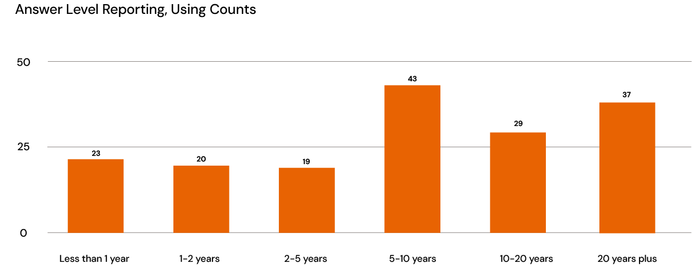
A colorful chart with rows and columns filled with numbers, including values like 3, 4, 5, and some in red indicating lower values, possibly a heatmap or matrix.

Histograms

Histograms are an excellent way to show the diversity of responses and collected data, empowering you to see the distribution pattern of your assessments in a single glance.

Histogram showing age distribution with ranges labeled 21-30, 31-40, 41-50, 51-60, 61-70, 71-80, 81-90, and 91-100. Bars are higher for the 51-60 and 61-70 ranges, and lower for 21-30, 31-40, and 81-90.

Stacked bar and column charts

Stacked Bars and Columns are perfect for showing the distribution of answers within a cohort report. Answers can be grouped (e.g. Agree / Strongly Agree) if preferred.
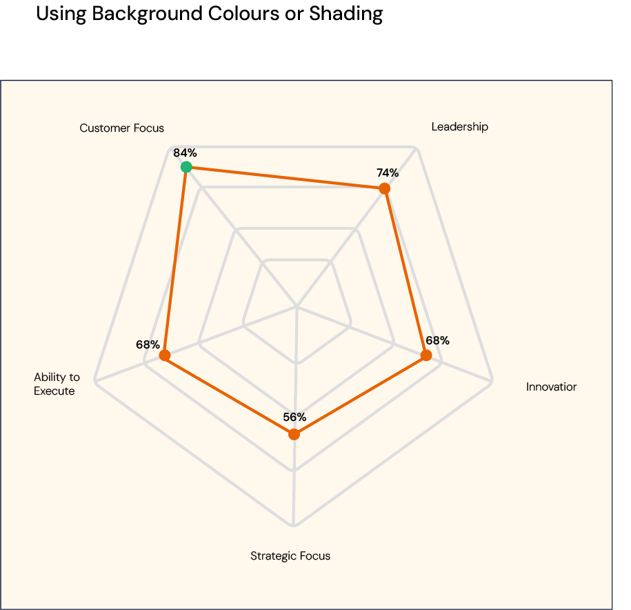
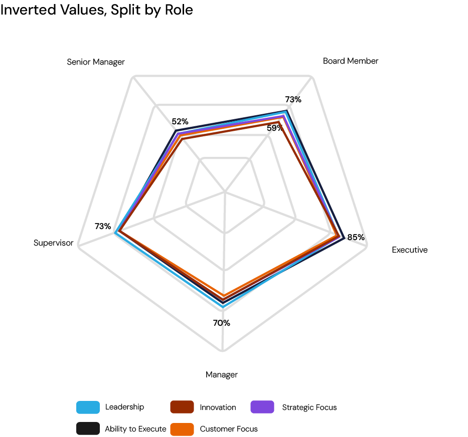
Bar chart showing percentage of US adults considering different meal choices, with options labeled as Vegetarians, Fish Eaters, Red Meat Eaters, and No Preference, across four categories. Vegetarians are 17%, 26%, 32%, and 44%; Fish Eaters are 16%, 27%, 19%, and 33%; Red Meat Eaters are 67%, 47%, 49%, and 23%.
Bar chart illustrating several statistics with green, orange, and brown segments. Each bar is labeled with percentages, showing the distribution across different categories or groups.

Spider charts

Functionally similar to Polar Charts, Spider Charts offer a web-like view of comparative data across multiple sections, subsections, questions, or segmentations

3D spider chart displaying five categories labeled 'Speed,' 'Reliability,' 'Comfort,' 'Efficiency,' and 'Cost' with respective ratings indicated by a connected orange line.
3D radar chart with five axes labeled 'Feature A', 'Feature B', 'Feature C', 'Feature D', and 'Feature E'. The chart has a white wireframe cube as background and an orange line connecting data points on each axis, indicating variable values.
Radar chart with five axes, showing data points connected to form a pentagon, with the points of a different color per axis.
Radar chart displaying data categories with scores from 1 to 5 in a 3D grid.
A 3D radar chart with five categories and data points at 56%, 68%, 74%, 84%, and 68%, illustrating performance metrics across different areas.
Radar chart showing scores in five categories: Customer Focus, Leadership, Innovator, Strategic Focus, Ability to Execute. Customer Focus and Leadership have high scores of 84% and 74%, while Strategic Focus has the lowest score of 56%.

Multi spider charts

These charts combine the features of Spider Charts and Multi Vertical Bar Charts, making them ideal for feedback and cohort reports that require detailed comparative analysis alongside benchmarks.

Radar chart comparing five categories, each with different colored lines representing data sets, with labels for categories and data points.
Radar chart comparing three categories, represented with blue, brown, and purple lines, set against a black background.
Radar chart displaying data across nine categories with multiple colored lines representing different data sets.
Radar chart displaying data for categories: Symptom Severity, Impact on Daily Life, Duration, Frequency, and Managing Symptoms, with multiple colored data series indicating different levels or groups.
Radar chart comparing four different categories, with each category represented by a different color. The chart displays percentage values for each category across multiple markers, with overall high scores in the teal and navy categories and lower scores in the purple and brown categories.
A radar chart comparing competencies of different roles in an organization, including Board Member, Manager, Senior Manager, Executive, and Supervisor across various categories like Customer Focus, Leadership, Innovation, Strategic Focus, Ability to Execute. Each role is represented by a different colored line and data points showing percentage scores.

Polar charts

Compare data across multiple categories, whether based on percentage scores or actual average scores. They offer a circular view of data, adding a unique visual dimension to your reports.

A pie chart showing data divided into segments with labels: 'A', 'B', 'C', 'D', with the segment labeled 'A' in green and larger, and the rest in orange.
A color-coded circular chart displaying the percentage of various types of cloud cover, including clear, partly cloudy, mostly cloudy, overcast, and fog, with respective segments in green, orange, and black.
Circular chart displaying survey results comparing the percentage of good health reported by males and females, with percentages for females at 74%, 84%, 68%, and 56% and for males at 68%, 74%, 68%, and 56%.
A circular chart showing market share percentages with sections in orange, teal, gray, and black
A circular diagram, a radar chart with five segments in orange, green, and brown, representing different data categories.
A circular chart with an outer ring and inner pie section showing percentages for Leadership, Innovation, Strategic Focus, Ability to Execute, Customer Focus. The inner pie has orange and green segments indicating different levels, with orange representing 56% to 74%.

Multi polar charts

Like Multi Vertical Bar Charts, these are used in feedback and cohort reports to juxtapose individual or group results with benchmark data. They offer the same circular view as regular Polar Charts but with added layers of information.

Polar area chart showing sales data with red and orange segments, labeled in percentages, titled 'Market Share of Smartphone Brands in 2023', with a key indicating red for 'Apple' and orange for 'Samsung'.

Line charts

This style of chart provides a smooth visualization of comparative data over multiple categories. They can be used with either percentage or actual average scores, offering flexibility in interpreting the data.

Line graph showing unemployment rates from 2019 to 2023 with peaks around 2020 and 2021, and lowest rates in 2022.
Line graph showing the effect of caffeine on alertness at different times of day, with data points decreasing from morning to mid-afternoon and increasing again in the evening.
Line graph showing percentage scores for leadership, innovation, strategic focus, ability to execute, and customer focus. Leadership is 74%, innovation 68%, strategic focus 56%, ability to execute 68%, and customer focus 84%.
Line graph titled 'Wage Growth by Industry 2000-2020,' showing wage growth trends across different industries over two decades with data points for the years 2000, 2005, 2010, 2015, and 2020.
A line graph showing the percentage of Americans feeling anxious about the economy from 2019 to 2023. The line fluctuates, starting at 74% in 2019, dipping to 56% in 2022, and rising to 84% in 2023. The graph uses green, orange, and red horizontal sections corresponding to different levels of concern.
Line graph showing the percentage of adult online grocery orders from 2018 to 2022, with data points in 2018 at 43%, 2019 at 49%, 2020 at 56%, 2021 at 55%, and 2022 at 45%.

Multi-line charts

Used in feedback and cohort reports, Multi-Line Charts show benchmark results alongside individual or group responses, facilitating a multi-layered performance analysis over time or across categories.

Line graph showing the consumer satisfaction over four years for five hotel brands, with DeLuxe Hotels maintaining high scores, Budget Inn declining then recovering, and affordable stays declining mostly, from 2019 to 2022.
Line graph comparing weekly performance of five different teams from week 1 to week 9, with team colors blue, brown, purple, orange, and black, showing trends in scores or metrics over time.
Line graph showing scores from 2013 to 2019 for three categories: Family, Friends, and Life, with Family showing the highest scores and Life the lowest overall.
Line graph showing the percentage of Americans who believe in climate change from 2010 to 2022, with color-coded lines for different demographic groups.

Area chart

Area charts are versatile, used for both comparative analysis and in conjunction with benchmarks. They offer a filled-in view between data lines, making trends easier to spot.

Line and area chart comparing responses and all projects across project scope, schedule, budget, management support, human resources, and organizational impacts, with data points and labels.
A line chart showing the percentage of importance across different project management categories, with Project Scope at 68%, Project Schedule at 20%, Project Budget at 47%, Management / Senior Leadership Support at 80%, Project Human Resources at 80%, and Business or Organizational Impacts at 70%. The chart has an orange filled area and data points marked with percentages.

Pie charts

Pie Charts are great for showing proportional scores for each section, subsection, or segmentation. Spotlight strengths and weaknesses and use in cohort reports to compare the number of responses per rating.

Pie chart illustrating people who prefer watching movies in theaters, at home with a streaming service, and on DVD or Blu-ray, with the largest segment being watching movies at home with streaming.
Pie chart showing the gender distribution of U.S. college students, with categories for Men, Women, Non-binary, Prefer to self-describe, and Prefer not to say.

Gauge / donut charts

Famous for their visual appeal, Gauges effectively showcase assessment scores and corresponding ratings through color-coding. These can be applied to sections, subsections, questions, or segmentations, offering a quick yet insightful look at performance.
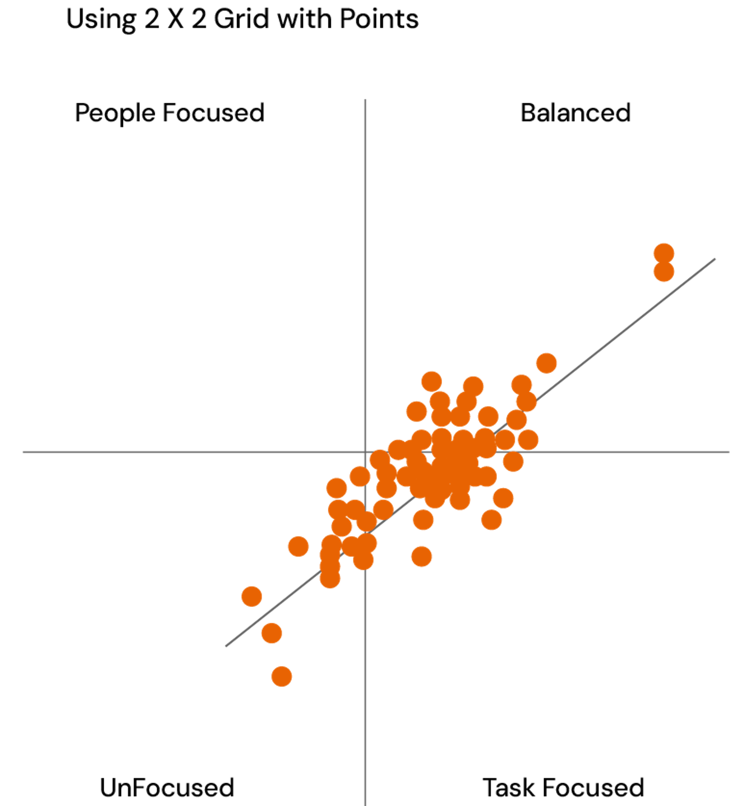
Six circular charts with orange and gray segments and numerical values inside. The charts are labeled Assessment (74%), Innovation (68%), Strategic Focus (56%), Leadership (3.7), Innovation (3.4), and Strategic Focus (2.8).

Scatter charts

These charts are designed to compare two distinct metrics, either at a granular level (each response) or a summary level (each Cohort or group). The option to include background images provides additional context, enhancing the overall understanding.

Scatter plot with orange data points showing a positive correlation, titled 'Correlation of variables,' with labeled x and y axes.
A matrix chart with four quadrants labeled People Focused, Balanced, Unbalanced, and Task Focused. The Balanced quadrant contains text indicating 76% People and 76% Task.