Spider charts in Brilliant Assessments
Spider Charts offer a web-like view of comparative data across multiple sections, subsections, questions, or segmentations. They often show apparent differences between areas of strength and weakness or iteration changes.
Brilliantly Customizable

Add classifiers to split by role, department or anything else!

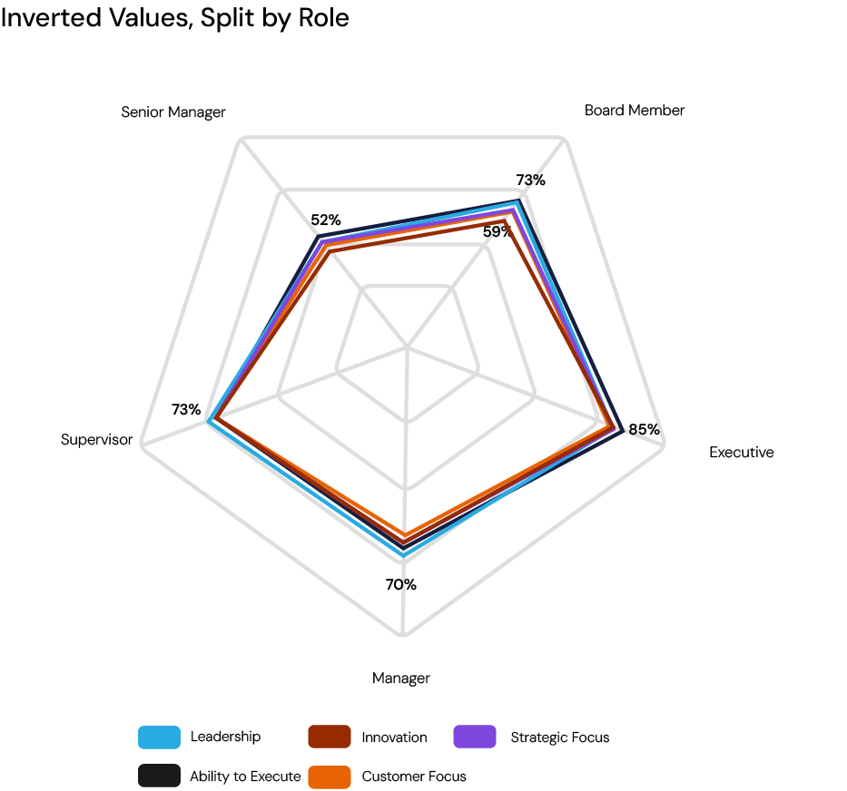
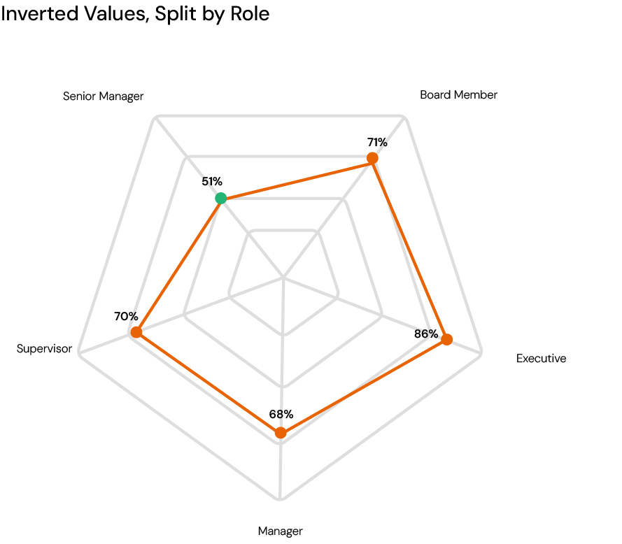
Invert the values to switch the axis and the legend

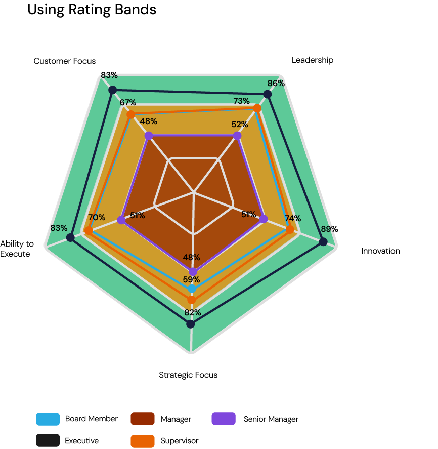
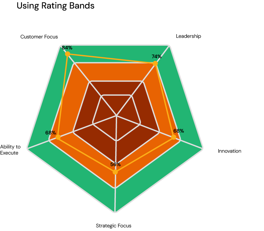
Add backgrounds, custom colors, labels, legends and rating bands.

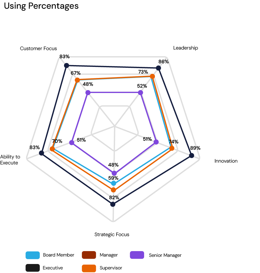
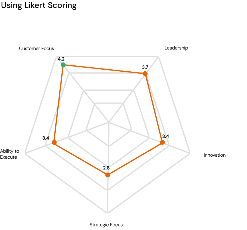
Display scores as Average Percentages, Likert Style or as Differences

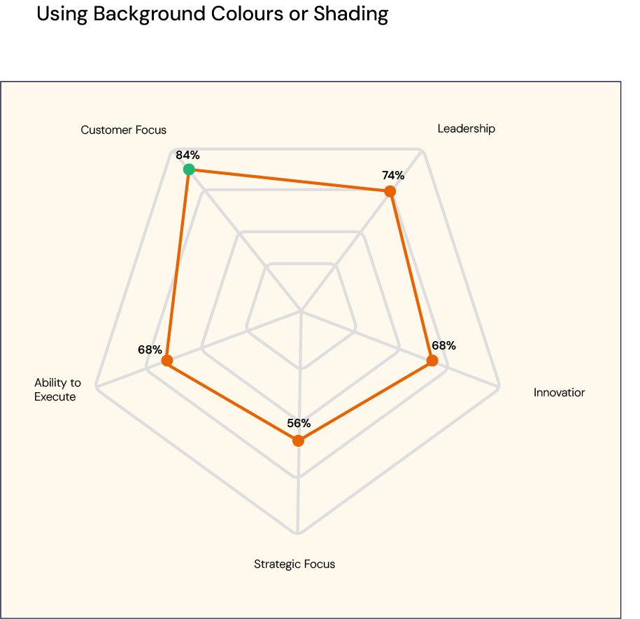
Spider Charts for Individual Results
Spider charts provide a powerful snapshot of an individual's performance across multiple dimensions. Identify strengths, spot development areas, and compare results to goals or benchmarks in a single, intuitive graphic.
Spider charts in Brilliant Assessments can be customized to reflect the structure of your assessment, with each axis representing key elements like sections, subsections, segments, or even specific questions.

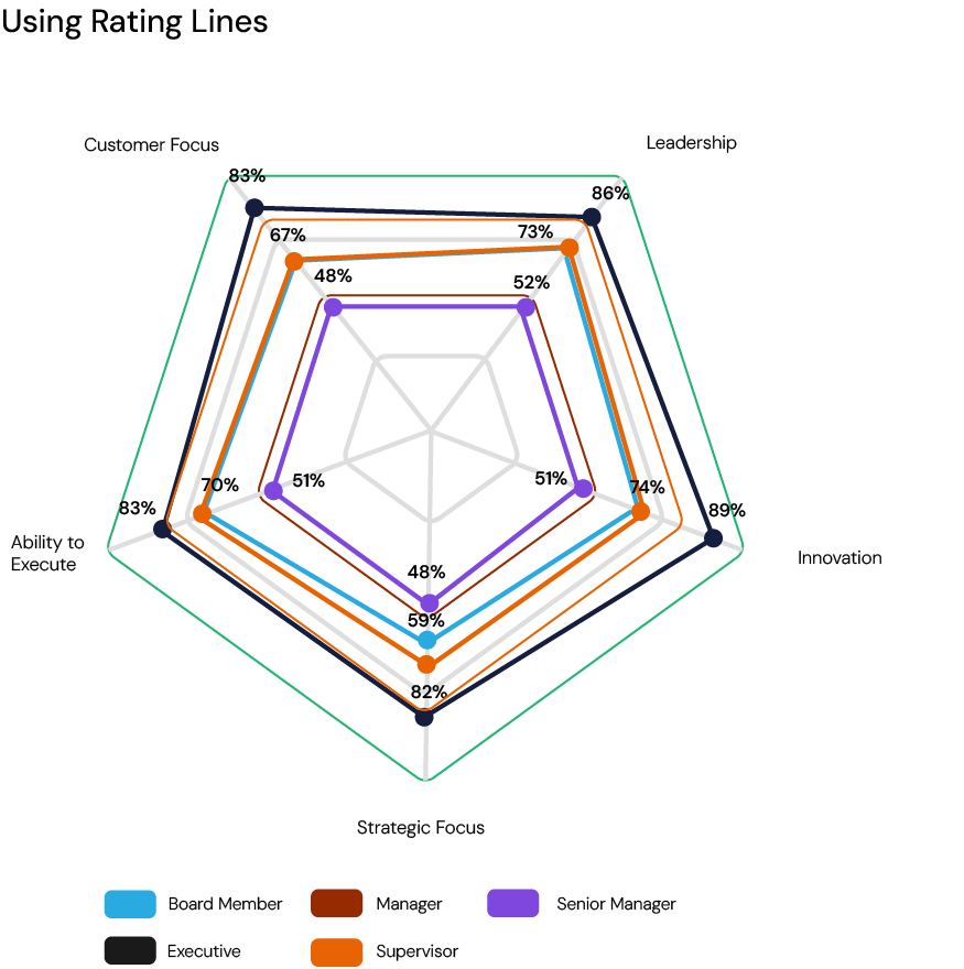
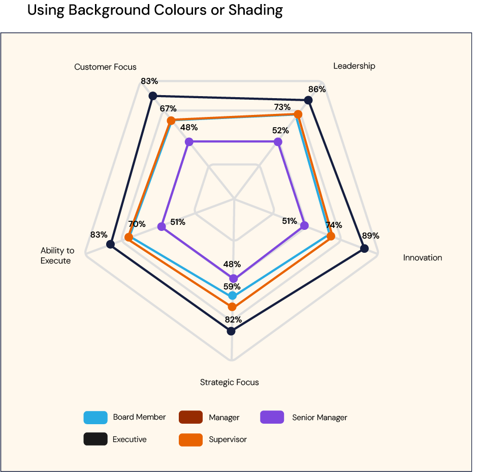
Multi-Spider Charts for Cohort and Benchmark Results
Brilliant Assessments multi-spider charts display multiple data series on a single chart, with each line in the legend representing a different classifier, benchmark, or respondent. This allows you to compare results across segments, such as departments, regions, teams, or roles, within the same visual framework.
The multiple layers mean, you can easily see how different groups perform across the same set of dimensions. Whether analyzing individual responses against a benchmark or different groupings as classifiers.
Spider charts
Spider Charts offer a web-like view of comparative data across multiple sections, subsections, questions, or segmentations.

Multi spider charts
Multi-spider charts combine Spider Charts and Multi-Vertical Bar Charts, making them ideal for feedback and cohort reports that require comparative analysis alongside benchmarks.